
Prose Meets Systems Design
A Case Study on Interactive Storytelling
The Project
FableLabs published interactive visual novels for mobile, where users shaped the story through dialogue choices. As an emerging market, my pitch and treatment for a multi-episode historical fiction visual novel series (phew!) had been greenlit. Now, the real work began. My goal: design a narrative system that delivered emotional engagement, meaningful choices, and smooth UI—all within mobile constraints.
Designing Depth Within Mobile Constraints
How do you create narrative depth within mobile UI constraints while keeping players emotionally invested and on-track?
This challenge lived in narrative systems thinking. The experience needed to:
Feel personal and dramatic
Clearly communicate goals and consequences
Maintain momentum across a multi-episode arc
At the same time, the UI allowed for only short bursts of copy and limited on-screen feedback, requiring microcopy that pulled double duty: immersive and functional.
Prototyping a Narrative UX from the Ground Up
My background in game and narrative design prevented me from jumping into the company’s proprietary editor right away—too many bells and whistles; too many distractions. I knew I needed to concentrate on writing a solid story with meaningful choices first. And I needed a simple tool that would react to the lightning pace of my thoughts.
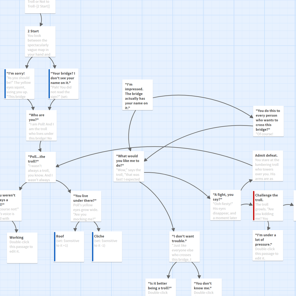
A segment of branching fiction in Twine.
Rapid Story Prototyping
I chose Twine as my tool for fast, low-complexity iteration. This allowed me to:
Structure core plot beats per episode
Establish narrative tone and draft prose
Test pacing and flow of decision points
Understand meaningful branching

Four flavourful player choices of <60 characters each.
UI & UX Integration
With the narrative drafted, I imported into the editor where I began to solve for player-facing UI & UX considerations:
Choice microcopy: On-screen real estate was technically limited for player choices, which meant that button microcopy needed to surface choices clearly and succinctly so that players could feel confident in their choices. I wrote detailed lead-ins to allow player-as-character microcopy to communicate choices simply while retain narrative immersion during taps (see image to the left).

Visually unique UI adding clarity while reinforcing progress.
Narrative goal-posting: I embedded on-screen “story goals” (e.g., Discover Mary’s secret!) to keep players narratively on-track at the beginning and throughout each episode.
Game mechanic reinforcement: I integrated visually distinct iconography and tutorial UI to reinforce that players were on the right path. It also served to show players that story progress was being made, fostering momentum through the episode (see image to the left).

Unlockable player choice using currency.
Live Player Metrics & Iteration
Post-release player metrics required me to make dozens of small adjustments within the editor and re-publish refined versions of each episode until said metrics were reached consistently:
Player falloff: Live data showed falloff when players went more than ~15 taps without a choice. I embedded decisions every 10-15 taps to reinforce interactivity. I solved this with “flavour choices”—low-stakes responses that boosted agency without derailing the main storyline.
Reward loops: I gave players plenty of story-unique currency each episode that could be spent on-mass to unlock big key decisions. However; live data showed that players spent their currency frequently. I returned to each episode to add multiple opportunities to spend smaller amounts of currency, often rewarding players with additional backstory, world lore, or memorable character moments (see image to the left).
UX That Supported Emotional Engagement
After all the hard work, was the UX successful? Live player data showed a ~70% clickthru rate within the first 50 taps, reaching slightly higher than average for other stories on the platform. In addition, episode one featured a 65-70% retention rate of players, signaling high investment and monetization for the series.
And as a storyteller, player feedback like this is pretty awesome, too:
“I just read the 3rd chapter. It has peaked my interest because of so many choices!” —kleine2022
“Eeeeeeeek … this is getting more and more exciting! Starting ep 6 now. I’m totally hooked!!” —victoriamasina
“The secrets are the best part right? I want a SCANDAL or nothing!” —brooke
“I am definitely hooked after reading this chapter! Can’t wait to see what other royal secrets will be uncovered!” —yvonneparis
Becoming a Better Storyteller
Fostering narrative depth isn’t just about a good story, but embracing the systems design to creatively add to the UX:
Microcopy choice text was simply written as player-as-character, allowing players to easily evaluate choices without breaking narrative immersion.
Visually unique iconography and tutorials reinforced positive player behaviours.
Goal-posting and plentiful choices established and maintained live-player momentum.
Game reward loops drove player accomplishment during scripted moments.